1. Optimize For Mobile First.
Here’s a secret for you: no one is viewing your website on their desktop or laptop. Ok, maybe not NO ONE but a majority of your users will be viewing your site on their phone or tablet.
Not convinced? Google says that search traffic from mobile devices now surpasses desktop searches. For your business, this means that If your site is not mobile-friendly you’re missing out on over HALF of your potential traffic.
2. Usability is more important than your design.
It doesn’t matter how beautiful your design is if your audience can’t use it. Here are some questions to ask yourself about your website:
- Is the text large enough to read?
- Is the text the right color (read: no dark colors on dark backgrounds or vise versa)?
- Does your content load quickly?
- Is it easy to navigate around your website?
- Is it clear right away what I can do for my audience?
- Can my audience easily contact me or buy from me?
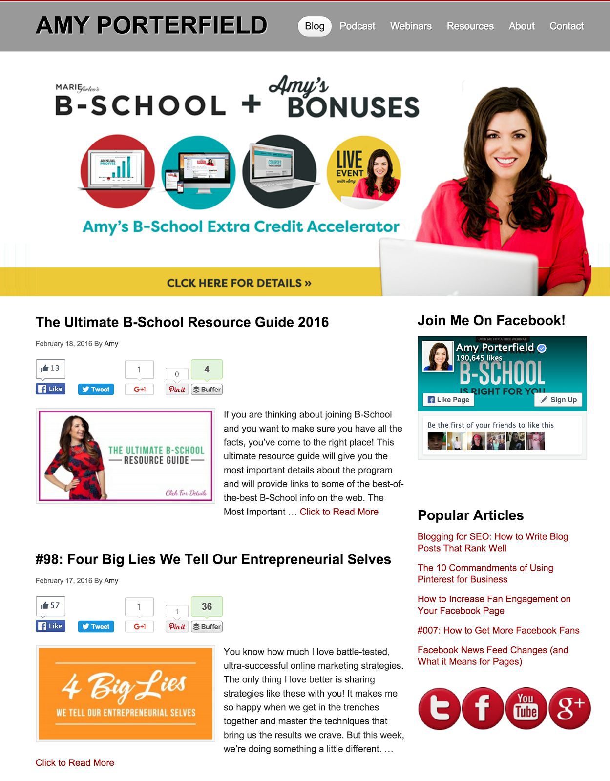
I think Amy Porterfield’s site is a great example of a highly-usable site. The design is clean, easy to navigate and clear what she’s doing.
3. Make newsletter sign-ups your #1 goal.
 You may be thinking, “phsst, yea right. SALES should be my #1 goal”. But think about this: how many times have you visited a website for the first (or even second or third time) and bought something? I bet the answer is “not many”.
When you get visitors to sign up for your email list you’re then able to start a relationship with them. Send them VALUABLE content (not just sales pitches) on a regular basis and watch that list turn into customers.
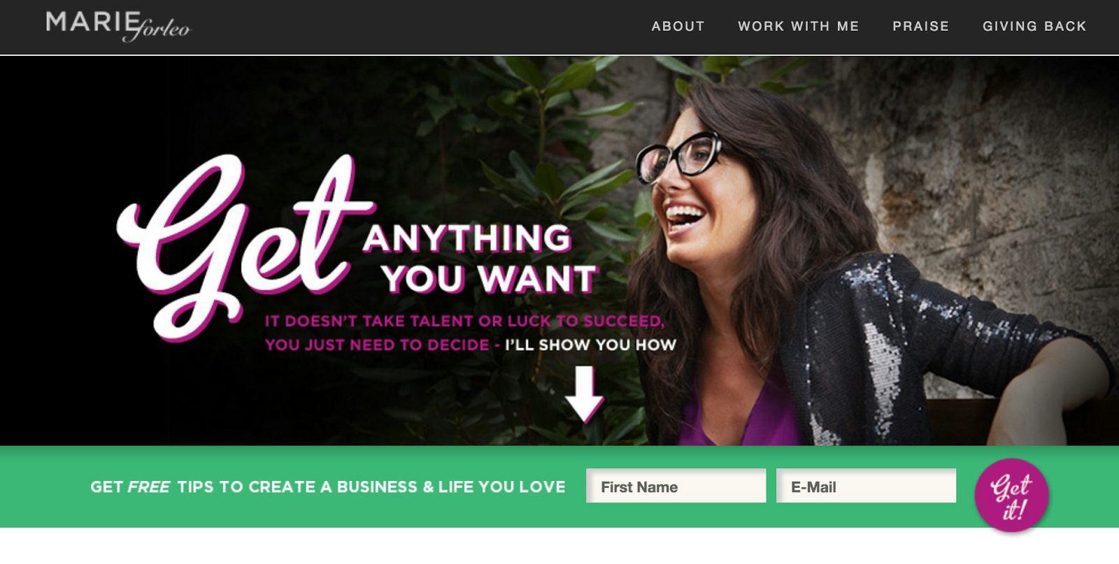
Here’s an example from Marie Forleo. She’s a highly successful business coach with lots of paid programs you can buy from her. But one of the first things you see when you go to her site? Her newsletter sign-up.
Notice the title she’s using “Get Free Tips to Create A Business & Life You Love”. That sounds a lot better than “Newsletter Sign-Up” right? Lure your audience in with something they’ll actually want to sign up for!
4. Have multiple ways to get in touch.
Do you have a contact form on your website? You should. It’s not enough to just have your email address listed. People like to reach out in different ways. Some people will want to email you directly, others will want to use your contact form and some may even want to pick up the phone and call you. Give people these options and make it obvious how to get in touch with you.
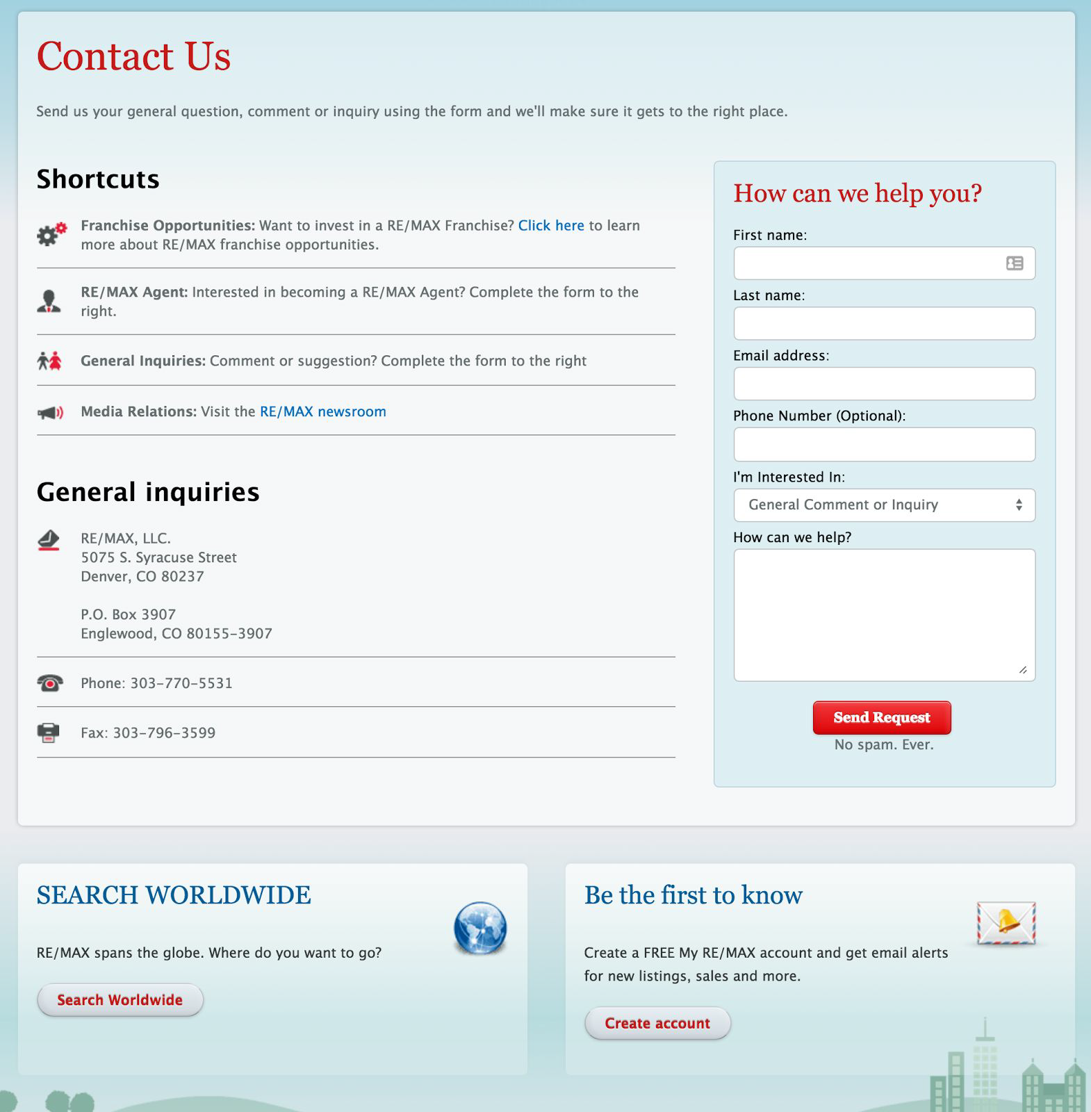
I think this is a good example from Re/Max. They have a contact form, address, phone and fax number as well as some shortcuts pointing to other ways to get in touch regarding specific questions.
P.S. You need to respond quickly to all inquiries — ideally within 1 business day.
5. Reviews and testimonials are crucial.
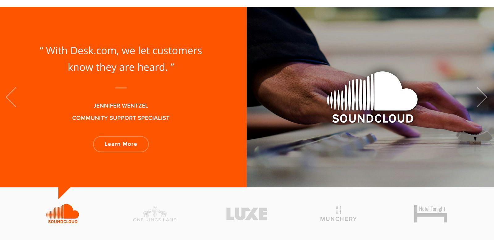
People need “social proof” that your product or service is as good as you say it is.
Include a headshot and title for each person providing your testimonial. Ask for feedback and endorsements from all your clients! Keep a file of these somewhere handy so you can keep your site fresh with new testimonials.
Example time! I love what Desk.com (Salesforce Desk) has done with testimonials. They use bright, bold colors, striking imagery and the client’s logo.
6. Your blog = lead generation and site traffic.
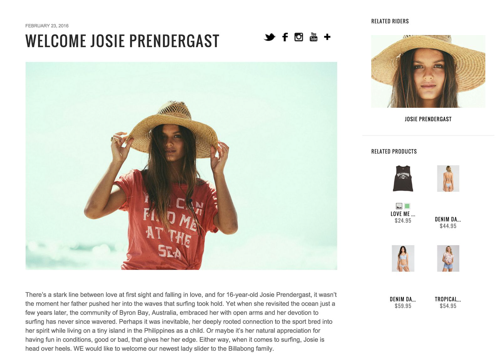
Your blog should be the backbone of your website. High value content (educational and/or useful for your audience) will naturally bring in traffic.
Consistency is key here! Aim to release one blog post a week. Quality trumps SEO here so focus on great content first and optimize for SEO second.
Make sure to include at least one high quality image with each post. Break up content into “bite-size” chunks by using headlines and short paragraphs.
I think this is a good example from Billabong. They’re using a great photo and they’re also utilizing the sidebar by displaying “Related Products”.
7. Make it easy to share your work on social media.
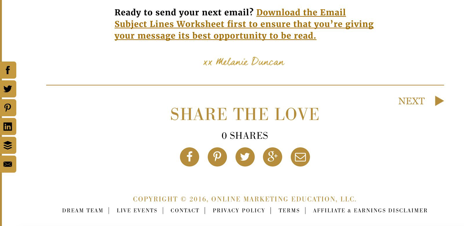
Don’t just link to YOUR accounts and stop there. Allow people to share, tweet or pin your work to their own networks. Make it easy for them to do the selling for you 🙂
This is a great example from Melanie Duncan. At the end of her blog posts she has share buttons and she ALSO has share buttons on the left side of the screen. Those left-hand buttons follow you around the site so you can easily share any content, even if it’s not a blog post.
What’s the verdict on your site? Do you have all of these? None or some?

